
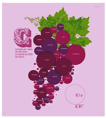
My favorite maps, or graphs, or charts, or whatever you want to call them, are like this - they take dry statistics and convey them in a completely visually compelling manner. On Strange Maps, each map comes with a couple of paragraphs of analysis and discussion, making it a really valuable resource.
And as for this map, I would put it in my kitchen in a heartbeat (or the wine cellar). My favorite finding is that the US drinks wine at roughly the same rate as Finland. So random, so interesting. Surprising? I'm not sure.

1 comment:
I love Strange Maps. It's such a cool website!
Post a Comment