
(Warning: I have an extremely annoying head cold that's getting in the way of my thinking. What follows is most likely poorly thought out and poorly written. I'll edit it tomorrow - promise.)
As I've mentioned before, despite my ad agency pedigree, I'm a sucker for marketing. And this is especially true when it come to food.
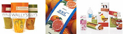
Take these three pictures. I'm probably most likely to actually eat something in the mix of stuff on the far right. But I'm definitely most likely to buy the crazy fruit combos on the far left. Buy, then let sit in my pantry or refrigerator until I totally forget about them, then they start to smell, then I have to throw them out.
And I'm SO least likely to buy the oranges. I like oranges. But the packaging? It doesn't connect with my pretentious internal brand. Or something like that. It's not terrible, but it's so...old looking. (I also like complicated products that are difficult to describe and often even more difficult to eat. In the battle of crazy fruit combo vs. oranges, CFC wins every time.)
Which is why my pantry is currently full of ridiculous products from Trader Joe's and Target.
(This is also not to say that I dislike the packaging on the right. It's got some charm and it's very clean. But there's just something about those Wally's fruit bags, or whatever they are, that screams "I'm designed like a shelter magazine - buy me!" to me.)
2 comments:
I am swayed by the packaging of food. If its pretty on the shelf, it must be taste pretty good too. Although my rather miser-inner self moderates my spending spree, I still tend to go for the pretty and not the cheap.
Nice read. Made me smile.
sincerely,
Rochelle
abc-packaging.com
Thanks, Rochelle!
Post a Comment